I spend several hours most work days making spreadsheets (AKA “engineering”), so naturally when I came across Dick Howe’s post last weekend detailing the expenditures of the eighteen City Council Candidates for Lowell’s 2017 elections, I wanted to throw that sweet, sweet data into Excel. I like taking otherwise boring data and seeing what it can tell you about the environment from which it arises. I realized that I had no idea how much money it took to run a successful bid for City Council, and whether that amount was uniform among candidates. Perhaps the data could also tell you something about which candidates over-performed and which under-performed, and begin to inform theories as to why (this is how I would normally approach any given engineering problem).
Compile
The first step in a good analysis is to dig up as much relevant data as you can. In this case, that includes the vote tallies for each candidate, which are also found on Dick Howe’s blog. After a bit of data entry clean-up, I have a table of all 18 candidates, along with the figures for how much money they raised, how much they spent, and how many voters they managed to convince to vote for them last November. To this I added data on the candidates from Lowell Votes, categorizing each by incumbency, neighborhood residency, and stance on the ever present “high school debate.”
For the uninitiated, Lowell’s local politics have been largely dominated for more than the past year by a single, very contentious subject, the site for a new high school. The two camps are the “Cawley supporters,” who favor a brand new campus constructed at the site of Cawley Stadium, and the “Downtown Supporters,” who prefer a plan to renovate the existing high school in downtown Lowell. For the record, I don’t have a particular dog in that fight, but it as it has eclipsed essentially all other matters for so long, it seemed like a potentially interesting lens to use to view the data.
With my data collected (seen at the top)1, it’s time for the good stuff: calculations, categories, and charts!
Calculate
Once the data is compiled, the next step is to perform some basic calculations. Averaging the values for all 18 candidates defines what an “Average Candidate” looks like in this dataset. From that average, you can calculate the standard deviation, or how far from the “normal” each candidate actually performed. This is useful for identifying major outliers, or anyone who falls very far away from the pack on any metric. For example, let’s look at an outlier on Total Spending, Dan Rourke.
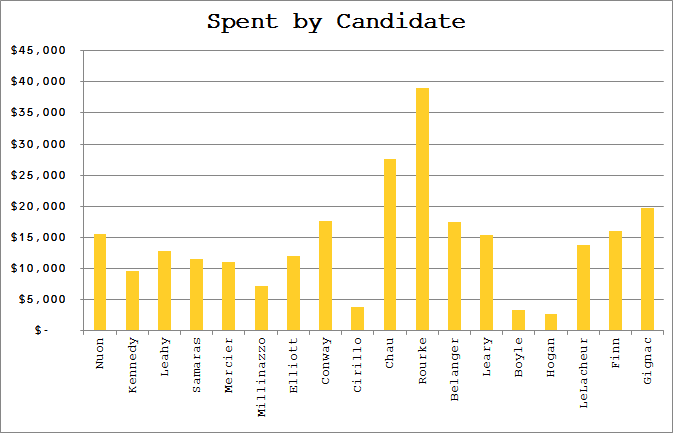
According to this data, Rourke spent $39,079 on the 2017 election. If someone just told me this fact in isolation, I’d have no way of evaluating whether that is a lot or a little. I’d probably respond with a simple “OK” and forget I ever learned that random trivia. But by knowing that the Average Candidate spent $14,350, I have some context, and can start to formulate some questions. One step further, knowing that the standard deviation for spending across the whole population of candidates was about $8,500, putting Rourke at 2.91σ, I learn a lot more about just how far his spending was from the norm.2
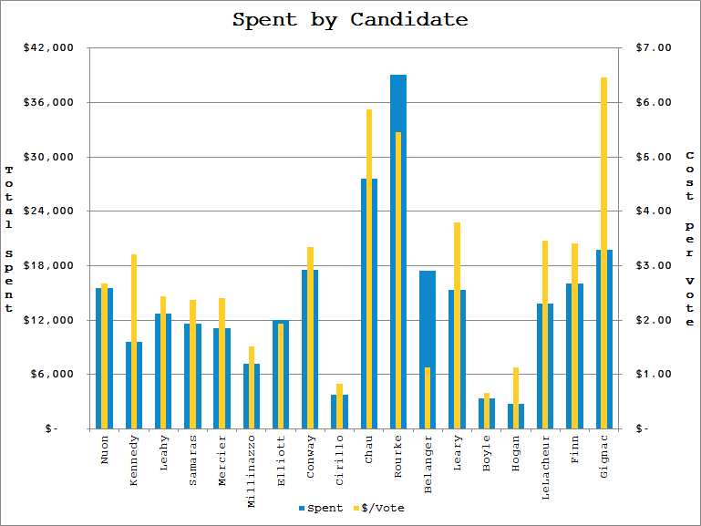
In addition to mean and standard deviation calculations, I also look at what each individual vote cost each candidate. This is done by dividing the total spent by the number of votes cast for the candidate (voters were able to cast up to nine votes for nine councilors, so this isn’t cost per VOTER). Here we learn that the average vote cost about $2.89 (standard deviation $1.65). This cost ranges from $0.66 per vote for Joe Boyle to the $6.46 that Robert Gignac spent on each of his votes. I’m not implying that campaigning is this transactional, but I find it fascinating that these values range by a full order of magnitude.
Above: How much each candidate spent, ranked left to right by vote tally.
Below: Plotting the number of votes versus the amount each candidate spent shows no strong correlation.
Following these calculations to assess candidates individually, I move to group comparisons by creating categories.
Categories
To begin any kind of analysis, it is helpful to define the categories of items you are comparing. I like to have several “bins” to group the data into for a few reasons. First, it’s not always apparent which categorizations are meaningful when looking at the data alone. By having a few sets of categories to compare, you can get some sense of which are more or less significant factors in the outcomes. It’s also useful to include categories that don’t seem like they should matter; often the results are surprising.
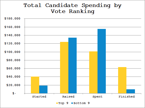
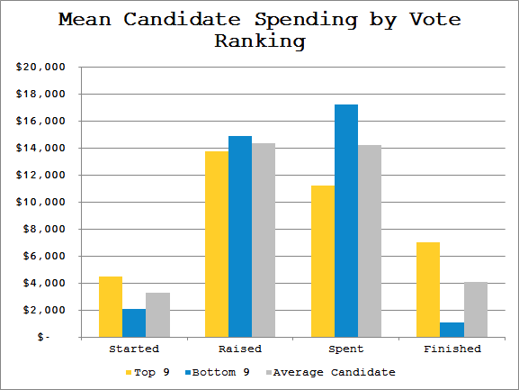
The first, most obvious way to categorize the candidates is as “Winners” and “Losers” (or more neutrally worded, “Top 9” and “Bottom 9”). Here again, it is important to have defined the Average Candidate for context. But by considering the category as a group, I can also make aggregate comparisons, and even compare group averages (Average Top 9 Candidate vs. Average Bottom 9 Candidate vs. Average Overall Candidate). For instance, binning allows me to see that Top 9ers spent 39.5% of the total campaign expenditures, yet earned 57.9% of the aggregate vote. This may run counter to the impression that better funded campaigns will necessarily perform better.
I’m also considering each candidate’s incumbency, their neighborhood of residence, and their stance on the high school question. In each case I compare the group average to the overall average, and look for strong displacements. If the factor played an important role in the group of candidate’s performance, you would expect to see that group deviate strongly from the overall averages.
Above: Total campaign spending.
Below: Mean campaign spending.
Taking the mean of each group and comparing to the overall mean shows that both winning and losing candidates raised about the same, but Top 9ers were left with gas in the tank at the end of the race, as they didn’t spend as much as the bottom of the field.
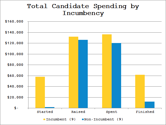
Above: Total campaign spending.
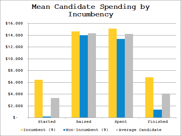
Below: Mean campaign spending.
Incumbents and newcomers spent nearly identically, though incumbents both started and finished with funds in their coffers.
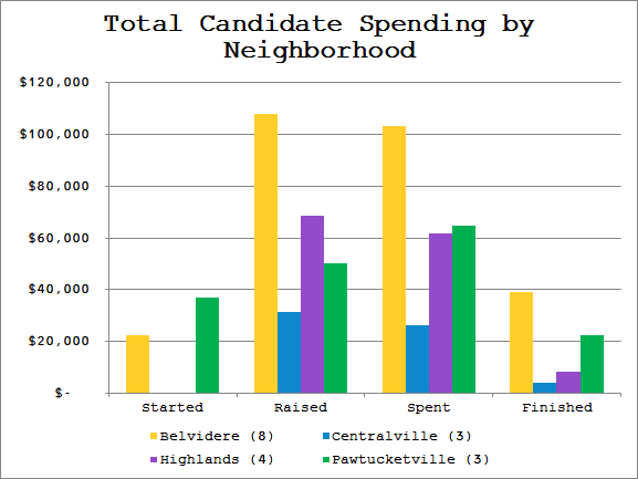
Above: Total campaign spending.
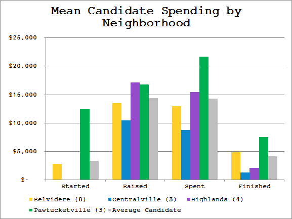
Below: Mean campaign spending.
This categorization illustrates the pitfall of looking only at the aggregate for each group. As a group, Belvidere outraised and outspent the rest of the field by a large margin. But by normalizing for their larger candidate pool, Belvidere candidates were actually below average for spending.
Above: Total campaign spending.
Below: Mean campaign spending.
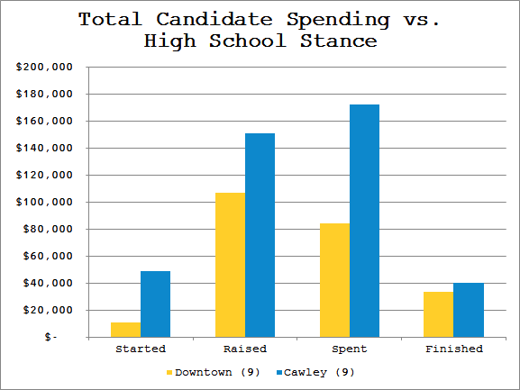
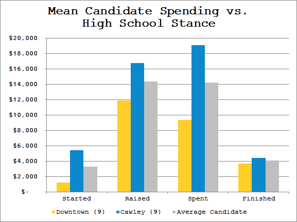
Overall, the Cawley supporters spent twice what the Downtown supporters spent.
There are any number of other categories that one could investigate, like demographics (age, ethnicity, gender) or political stance on other issues. I don’t have access to all of that data, but I’m sure similar analyses could be performed across many other factors. There are even multi-factor analyses (ie. Bottom 9 AND Incumbent). However, there is a limit to how useful such categories can be; if the sample sizes are too small, they can easily be thrown off by a single outlier. While both the Incumbency and High School Stance divisions were 50-50, this seems to have been significant when looking at the Neighborhood groups. Both Centralville and Pawtucketville had only three candidates, and Highlands had four; the remaining eight candidates all reside in Belvidere. But even data that isn’t terribly robust can be insightful, and in the world of engineering there is no such thing as “all the data,” only varying degrees of “enough data.”
Compare
At long last, we are ready to begin comparing data.
For individual comparisons, we already looked at the high end outlier Dan Rourke. A few candidates that also jump out:
Vesna Nuon – Councilor Nuon tallied the most votes by a huge margin (2.42σ), while spending only very slightly more than Average Candidate
Karen Cirillo – Councilor Cirillo spent the least per vote of all Top 9ers ($0.82/vote), having raised the least of any winning candidate
Sokhary Chau – Mr. Chau raised more funds than any other candidate, yet fell just shy of the ninth councilor position
There are a huge number of reasons to explain how any candidate performs in an election, and I’m not claiming that the lens of campaign spending is particularly useful here. However, if someone considering a run for office in the future asked me for advice, I would recommend they look at the campaigns of these outliers from the last election. What about Councilors Nuon and Cirillo led to them outperforming the rest of the pack? Why did Mr. Chau’s campaign end up falling short? The data may not be able to answer these questions, but it is instructive about what questions to ask.
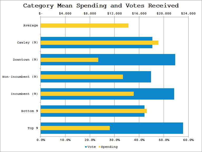
Moving on to the categories defined above, I can compare how they performed based on ballots cast in their favor. Let’s look at what was spent by each group and how many votes they received.
Comparing unrelated categories in this way shows the relative impact each factor may have had in the group’s performance. Looking at the impact of Incumbency reveals that incumbents spent slightly above average, and received slightly more than half of the votes. Contrast this relatively minor impact to the much larger distinction that High School Stance appears to have made; Downtowners received approximately the same number of votes as incumbents, yet spent far below average on their campaigns. This suggests that the high school question played a much stronger role in voters’ decisions than incumbency.
I break out each neighborhood group of candidates’ spending as a percent of the overall total, and compare to the votes earned by those candidates. This helps deal with the fact that the sample sizes for each neighborhood are different. You can see, for instance, that despite accounting for over 25% of the money spent on the campaign, candidates from Pawtucketville received only about 15% of the votes.
If I am evaluating competing product designs for a client at work, often the hardest part is knowing which factors of each design have the most influence over its performance. By grouping and comparing across multiple factors, I can start to understand which “knobs to turn” to get the best results.
One could look at a city council campaign as a product, and comparing data of past campaigns as a way of understanding the various factors that will either help or hinder its performance (ballots cast). Knowing, for instance, that incumbency isn’t particularly important to voters might suggest that a newcomer candidate shouldn’t bother spending a lot of their time signaling that fact. It might be more beneficial to focus on other aspects of the race (like the high school).
Conclude
So what is the point of all of this? What have I learned? I’m not entirely sure, to be honest. I’m not a political scientist, and I’m sure that there are any number of better or different methodologies that could be used to analyze this type of data. But I find it interesting to dig around in the numbers to build some context, some better mental mapping of what various statistics that get thrown around actually mean. It’s a good way to challenge your own assumptions, or even to determine what assumptions you hold.
For example, since I live Downtown, I saw a lot more Downtown High School support in my daily travels. I assumed that the Downtowners must have spent a ton of money campaigning on that issue. But looking at the data, it indicates that Cawley Supporters spent double the amount that Downtowners did. Perhaps that was obvious to others who frequent different parts of Lowell than I do, but I’m happy to be able to correct my misconceptions wherever possible. Exercises like this allow me to do so.
If I wished to continue working with this data, I would start looking for additional breakdowns of the votes cast, which would open up new lines of questions. How did each category of candidate fare in a particular neighborhood or ward? Where were votes for non-incumbents concentrated? Did votes for Downtowners follow any pattern by age of voter? I would also look to collect data from past elections to investigate trends over time. It becomes easy to see how much can be learned with some relatively simple data collection. In the era of “Big Data,” every local election can shed light on a host of different questions. And those questions in turn can lead to better conversations about what is best for the community.



“What about Councilors Nuon and Cirillo led to them outperforming the rest of the pack? Why did Mr. Chau’s campaign end up falling short?”
1. Nuon is a known quantity, and one of the subsidiary issues in this election is disenfranchisement of Lowell’s minority population, which helped him. Nuon is also pro-downtown, which is a big issue for Lowell’s minority voters, especially from the Highlands. Chau came very close, finishing tenth, but was pro-Cawley which hurt his turnout.
2. Cirillo is a bright, well-spoken woman who works for a construction company that specializes in restoring historic school buildings. That is a slam-dunk for the pro-downtown voters.